|
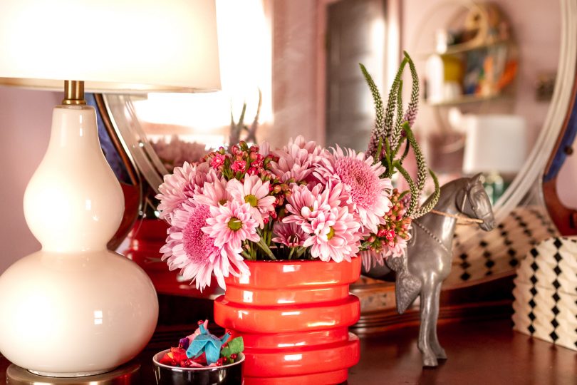
I enjoy working with clients so much, but am having a hard time figuring out how to meld my work with individuals and my desire to share design details here with all of you. I know I’d be upset if I were hiring someone to create something one-of-a-kind for me who then turned around and gave it all away for free to the world. It’s something I’ve seen others struggle with too, and I’m not sure there’s any single right answer. This design came about as I was thinking about a family room that I’m working on for someone, but in a different style and color palette and without some of the real-life limitations we’re working with. (It’s a tricky space, hence my being brought in to help.) Another difference is that I always specify retail for the blog rather than including custom or trade-only sources that not everyone has access to. So maybe this kind of approach is a possibility moving forward? A fictional design loosely inspired by something I’m actually working on? Either way, it was a lot of fun to pull together. I also want so much of this for my own home. Imagine this in our snug! 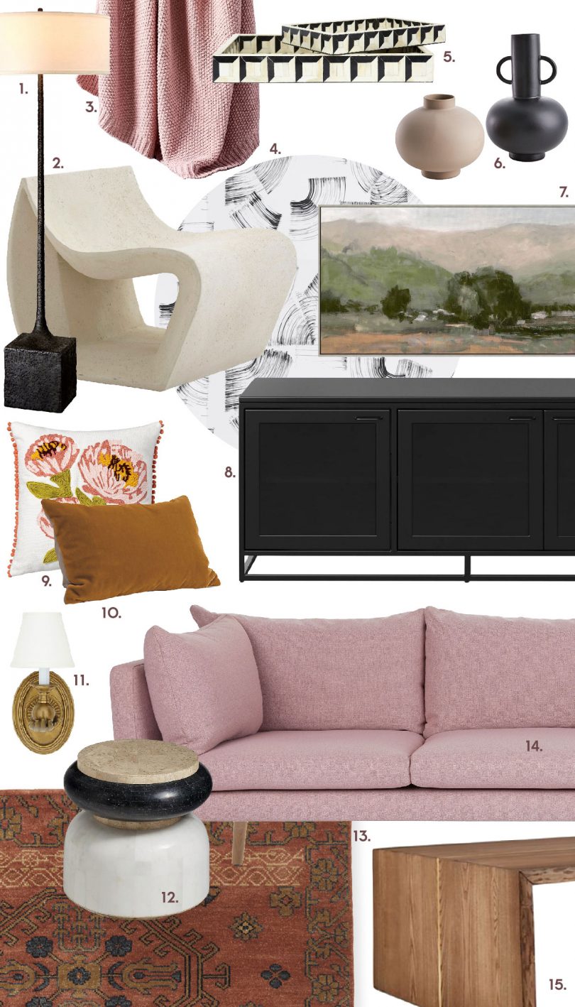
© 2020, published by Making it Lovely as Of Course I Included a Pink Sofa | No comments | This post may contains affiliate links; I will be compensated if you make a purchase after clicking on my links. The post Of Course I Included a Pink Sofa appeared first on Making it Lovely.
0 Comments

© 2020, published by Making it Lovely as Honor Roll | No comments | This post may contains affiliate links; I will be compensated if you make a purchase after clicking on my links. The post Honor Roll appeared first on Making it Lovely. Truly. Although, these do come in a rather nice ‘Italian Olive’ color as well. 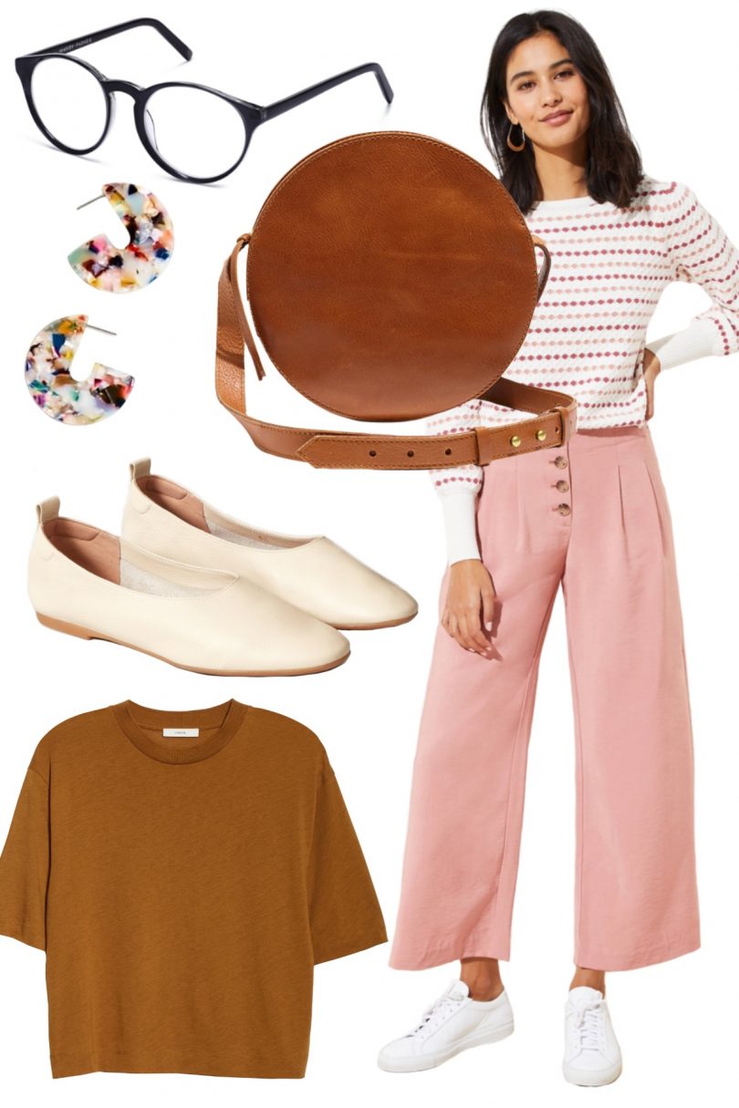


© 2020, published by Making it Lovely as Pink Pants are the Best Pants | No comments | This post may contains affiliate links; I will be compensated if you make a purchase after clicking on my links. The post Pink Pants are the Best Pants appeared first on Making it Lovely. Art, design, and coding for funsies! The kids and I have been making pixel art lately and I’ve been using mine to change the look of my farm and and farmhouse in Stardew Valley with some personal aesthetic mods that I’ve made. 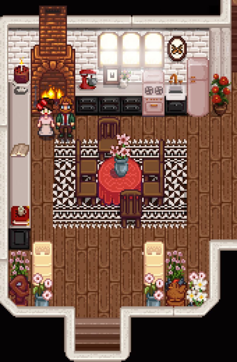
I had a pink Smeg or Big Chill fridge in mind when I was changing the vanilla kitchen. Then I added the Portal cake (no lie) and thought I should add a mixer too. And if I need a rug, you know I’m going to make a teeny pixel version of the wool kilim I designed for Annie Selke. I stand by this as a solid farmhouse kitchen design, digital or otherwise. I’ll leave it up to you to find Leah’s sculpture and a giant wooden chicken. 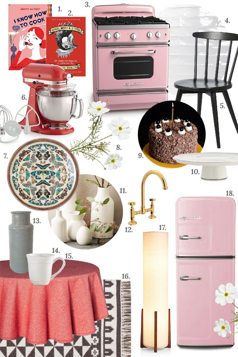
I mentioned on Instagram Stories that I’d share some of the resources we’ve been using to make mods, so that will be a future post. My SV house is all pinks and flowers, books and bugs, crystals and skulls, plus a good dose of my ever-favorite black/white/brass/wood combo. A lot like my own house (though I need more skulls IRL is what I’m taking away from this.) The base recolor I’m using is Toned Down Stardew Valley (ATDSDV) and the art is from Elegant Victorian Interior. I don’t have a mod ready for you to download if you want to add any of my customizations into your own games, but I’m giving you the pixels for now if you want to mess around with cutting and pasting them in on your own. If you already know what you’re doing, fit the kitchen into your farmhouse_tiles.png and the flowers and rugs into furniture.png files. The subway tiles belong in walls_and_floors.png. © 2020, published by Making it Lovely as A Lovely Stardew Valley Inspired Kitchen | No comments | This post may contains affiliate links; I will be compensated if you make a purchase after clicking on my links. The post A Lovely Stardew Valley Inspired Kitchen appeared first on Making it Lovely. We’re back from vacation and I’m feeling a mix of emotions as this new year begins. Nerves and excitement around shifting my business toward client work while figuring out how to still keep the elements of what I’ve been doing here (since 2007!) fun and fulfilling. The new decade feels like a new beginning. 
But then things also remain very much the same don’t they? Right now it feels most exciting to focus in on the little organizational projects have been put off. January will do that to a person. In our house, closets and cabinets stay neat but the piles that grow around them do not. The kids’ rooms after Christmas are stuffed with toys both new and old and the hall is collecting spillover. Clothes and craft supplies abound. Even our books have grown too numerous! Surely you can always find a spot for one more book, right? At some point, no. The whole house needs a good decluttering and it’s overwhelming but necessary for physical and mental space. 2020, last year of my thirties. First year of a new decade. I’m ready. © 2020, published by Making it Lovely as A New Year, A New Decade | No comments | This post may contains affiliate links; I will be compensated if you make a purchase after clicking on my links. The post A New Year, A New Decade appeared first on Making it Lovely. Sarah from Room for Tuesday and Chloe of Boxwood Avenue are hosting another Blog Hop Cookie Swap! The participants are linked at the end of the post, and everybody is sharing a different cookie recipe today. This is always fun because yes, great recipes, but also we get to see some lovely kitchens put to work. 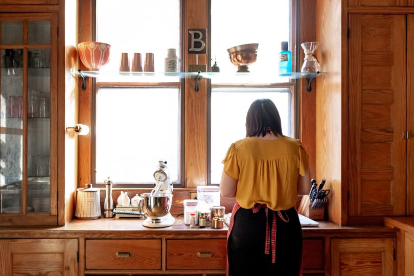

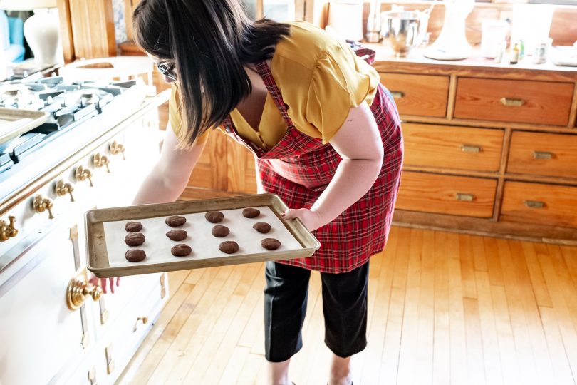
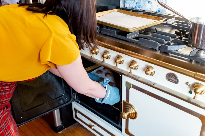
The first cookies we baked in our fancy pants new oven were the Coffee Walnut Cookies I shared in last year’s Cookie Swap. They were done in teeny batches of six because our previous oven was from 1918 and, shall we say limiting? We have since been able to move on to baking sheets that are of a normal size, hooray! (The fact that they’re pretty gold is a bonus.) This chocolate shortbread recipe is from an out of print cookbook, Nigella Christmas, but it can also be found online. I have tried the review-recommended additional flour and found it too dry, so I’d stick with what’s below. 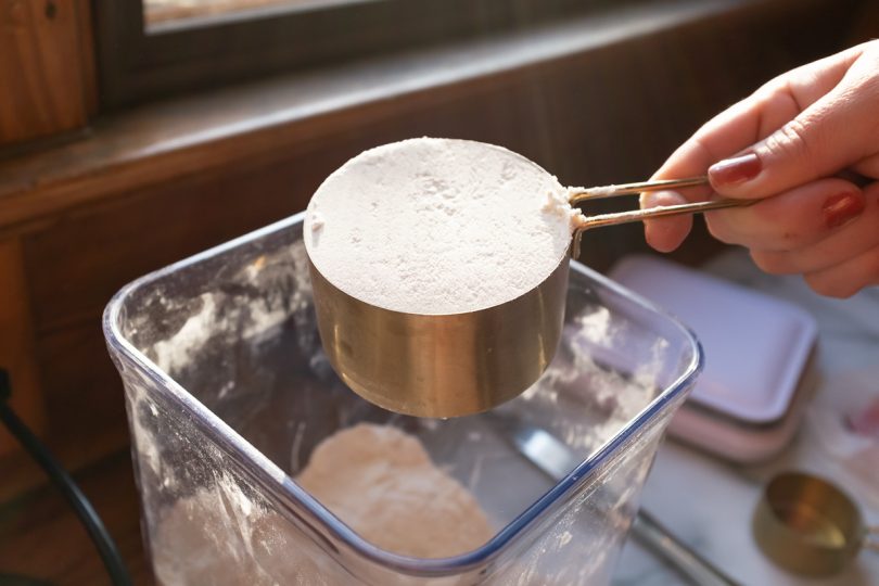

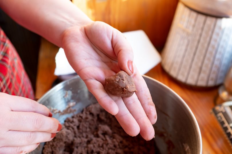
CHOCOLATE SHORTBREAD COOKIES Pre-heat your oven to 325° and line a couple of baking sheets with parchment paper. Mix the flour, baking powder, and baking soda together, set aside. Cream the butter and powdered sugar together. Add the cocoa powder, mix, then incorporate the flour mixture. The dough will be crumbly, yet will stick together when rolled into a ball. Flatten your little cookie dough balls slightly and arrange on the baking sheet, bake for 10 minutes. (Though my oven is quick, so these may take more like 12-15 minutes.) When the cookies come out, let them cool on a wire rack before adding the topping. 
TOPPING Start the chocolate sauce topping as your cookies go in the oven. Heat water and vanilla in a small saucepan, then whisk in cocoa powder and powdered sugar. Once you have a nice smooth consistency, remove from heat and let cool until your cookies are ready. It will thicken as it cools, so be sure to give it a stir every so often while you’re waiting. 

Drizzle the cookies with your chocolate sauce, then top with sprinkles, powdered sugar, or both. I topped mine all three ways so you could see how they look and decide what you want for yourself. I do like the crunch and look of jumbo nonpareils/sugar pearls/whatever you want to call them, but use whatever you like. 
The chocolate drizzle will set up a bit as it cools. Do feel free to eat them while still warm (I encourage you to!), but definitely wait to put them away or they’ll stick to everything. 

Ready for more recipes? There are 15 in this year’s cookie swap to try! 


© 2019, published by Making it Lovely as Chocolate Shortbread Cookies | No comments | This post may contains affiliate links; I will be compensated if you make a purchase after clicking on my links. The post Chocolate Shortbread Cookies appeared first on Making it Lovely. Welcome! Come on in and take a look around! My daughter Eleanor, 10-years-old and an absolute delight, wanted a room makeover. She and I worked together to update her room from little kid to tween, and it will carry her right through the teen years with way more style than I ever had when I was growing up. 
Thank you to Linda at Calling it Home for organizing the One Room Challenge and inviting me to participate again! Six weeks goes by so quickly (especially when you have a somewhat indecisive kid and a major color scheme change midway through), but it’s always the most fun and a really good kick to get a room totally redone. 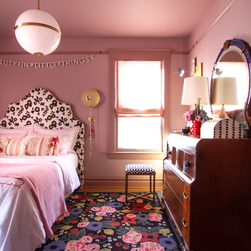
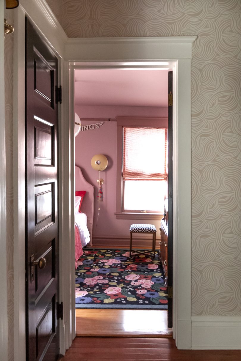
Pinky/purple/lilac/lavender/orchid/thistle. What do you call this color? I call it a color I never would have chosen myself, but one that my daughter wanted and that I have come to love. If you know me, you know I love pink, but I prefer it less saturated and on the peachy side. It may seem funny, but this particular color is a little outside of my comfort zone! 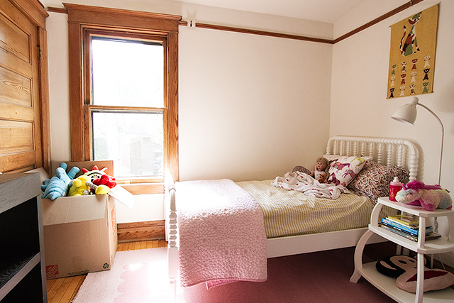
The room had white walls and wood trim when we moved in. We painted it dark blue when Eleanor was four (she chose the color then, too), but six years later is a long time in kid years, and she was ready for a change. 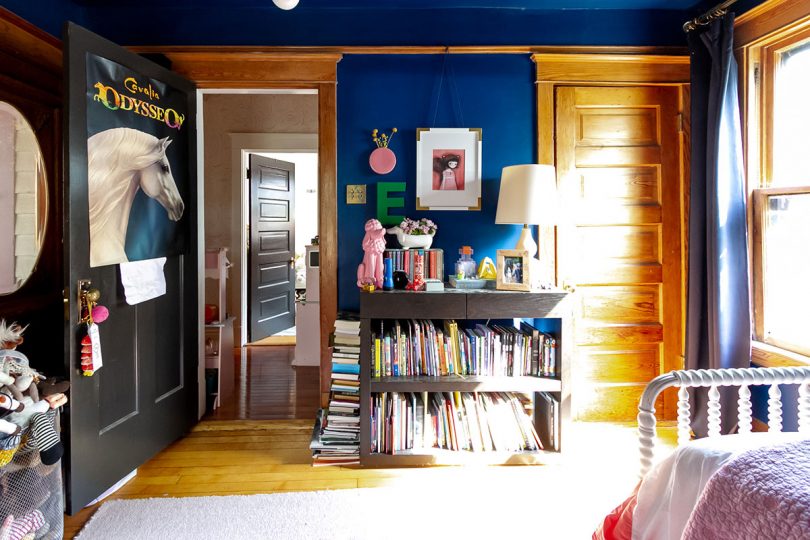
From Sherwin-Williams Loyal Blue to Benjamin Moore Magic Potion with Barberry painted trim. 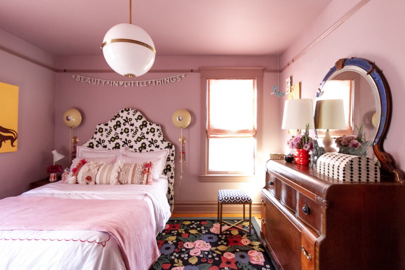
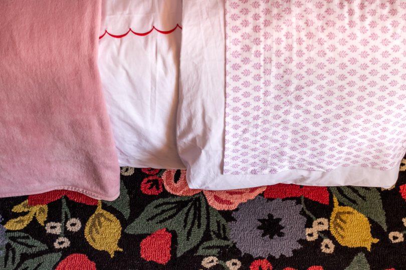
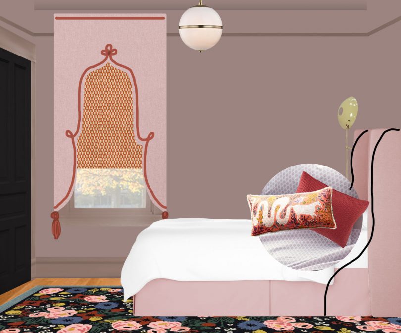
How pretty is that Rifle Paper Co. for Loloi Rosa rug? It was the first piece we decided on for the room and it set the tone for everything to come. It works beautifully with the mix of bedding you’ll see throughout the photos. The jersey-knit sheets are Eleanor’s favorite because not only does she like the lilac pattern, they feel like a soft t-shirt. All of the bedding is from Garnet Hill, and it can mix and match together in different ways to give E some options. 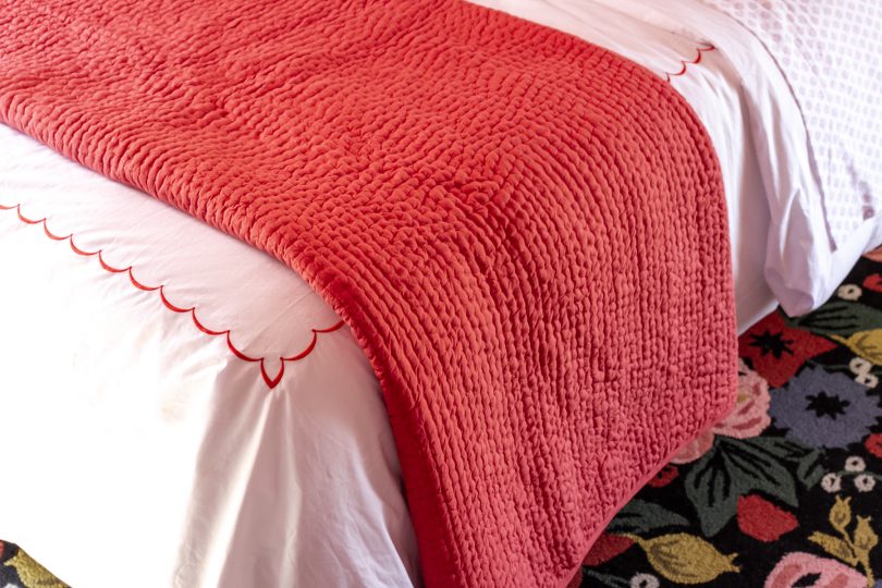
I had planned on making an upholstered headboard but instead found a secondhand Serena & Lily Pondicherry headboard to reupholster. Or more accurately, slipcover. It turns out we really liked the fabric it came with, so a slipcover will allow us to switch it up and keep the original patterned fabric safe and sound for future use. Slight problem: I’m not an experienced seamstress. It’s going to take me some time to learn how to do the slipcover, so I draped the fabric over top as best I could to give you an idea of what it will look like with the different bedding combinations. Which version do you like best? 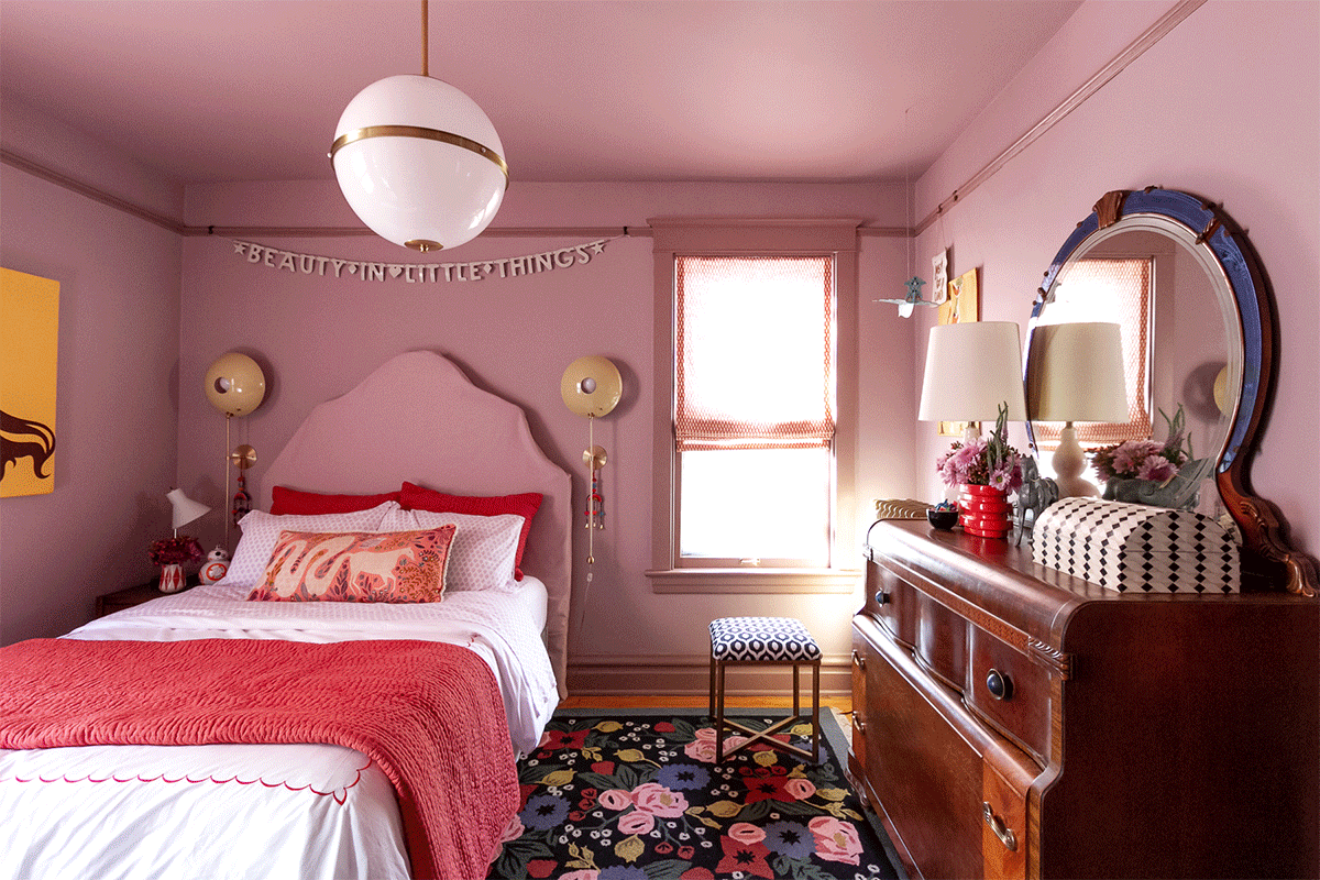
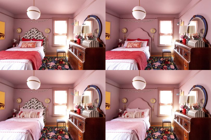
Obviously the bed in a bedroom, especially when it takes up as much space in the room as it does here, has a huge impact on the entire look. The tone on tone look quiets the design and is in line with my original intent for the room. E prefers the slipcover option too — every big decision in the room was made together. 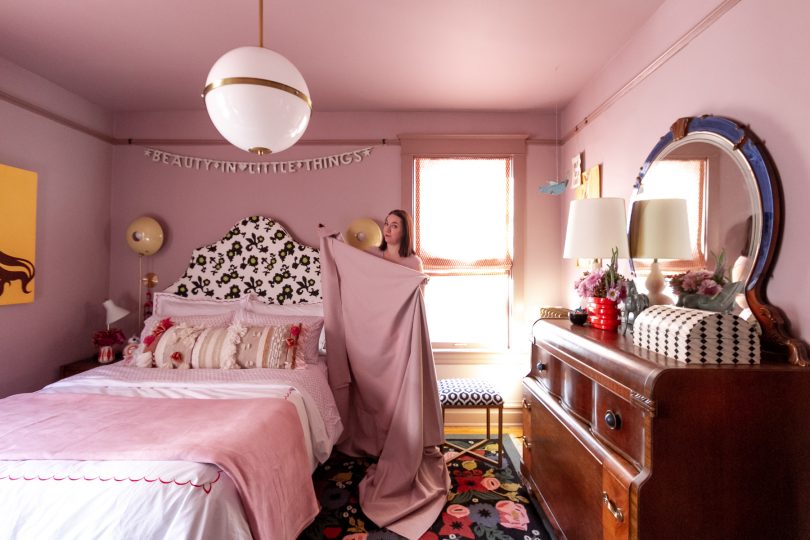
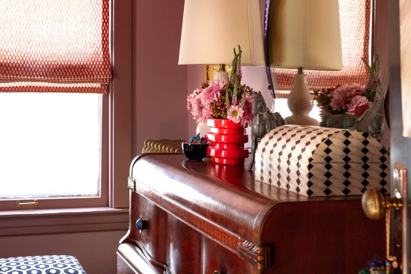
I recovered a small ottoman with Inner Circle fabric to give E a place to perch besides her bed. I also figured out how to make functional Roman shades! 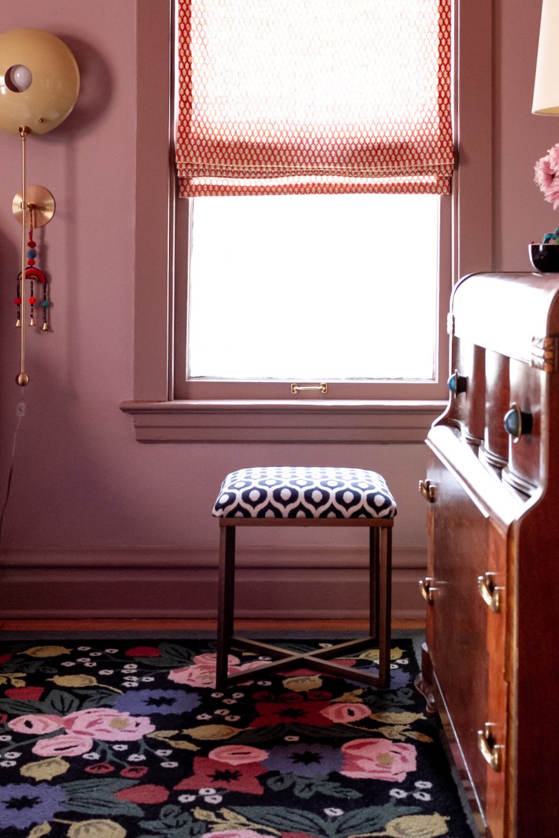
I’ve wanted to use this Edie Stroheim fabric for years. It looks amazing in E’s windows, and I love that red/orange Spice color against the walls and trim. And friends, I see that some of you have doubted this particular fabric choice perhaps more than anything else in the room. I get where you’re coming from! It works because the wood tones in the dresser and floor are very orange, and the red in the rug has a lot of warmth to it (rather than being a primary bright). Also, take into account the sun streaming through the linen, and it all just works. I adore it. 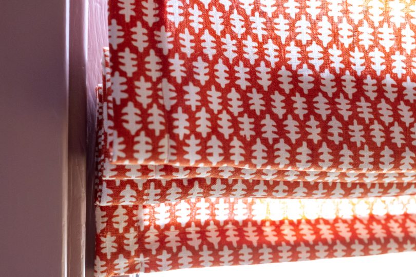
I stole my favorite decorative pillow from the guest room because it looked so dang good with the bedding, but most of the time E will probably have the other one in here (with the horse print). She says this one is too bumpy for her. It’s almost like kids don’t realize that sometimes the pretty pillows you put on the bed are just for show and they aren’t always the most functional thing but we buy them and put them there only to take them off each night and put them back in the morning, but I digress. 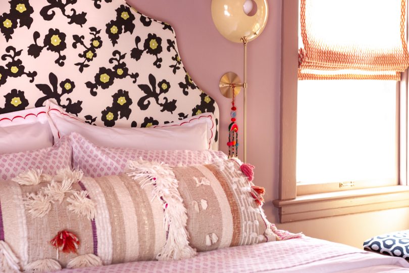
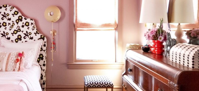
The nightstand is from Target, and I used one of the original Art Deco handles from her dresser on it to tie the two together. A nightstand with both a drawer and a shelf is always optimal, and E’s radio is tucked underneath so she can listen with (or often without) headphones in bed. The BB8 is her alarm clock. 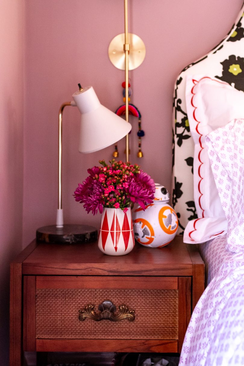
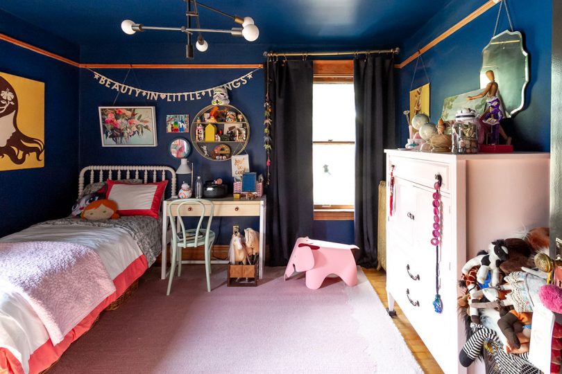
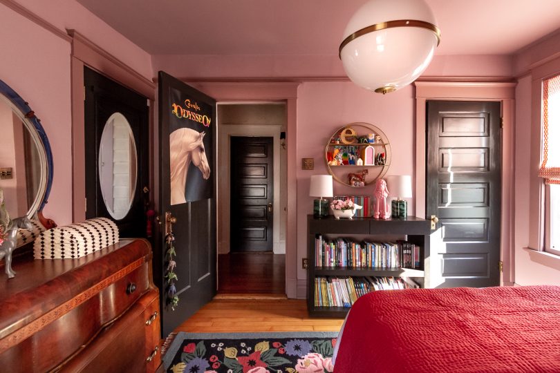
Opposite the bed is the entrance to the room, and Eleanor’s closet. Most of her toys are on shelves in the closet, but I rehung the circular shelf that was in the room before for E to display some of her favorite things. 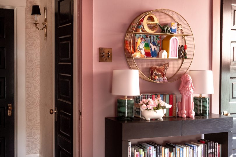
Books, books, books on a low Parsons bookcase. She’s a voracious reader! (Takes after her mom and dad. *dusts shoulders off*) We had to pare the books down quite a bit to get them to fit, but she had a lot that she had outgrown so those got passed down to her little brothers and it worked out. 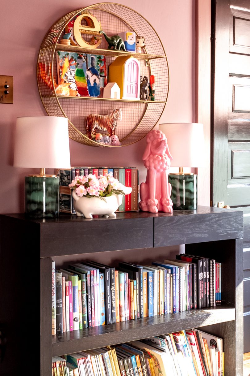
The details in Eleanor’s room will no doubt change over time. That’s what will let this room grow and change with her as she moves on from her tween years. Will she always love decorating with horses and cute animals? Maybe, but that’s for her to keep or change as she decides. 
We kept the art that was in the room before, just shuffled it around some. The hanging bird was from Land of Nod years ago, the cats are a vintage tea towel hung with dowels, and the “just be cool” banner was a favor from when I took a video editing workshop that DesignLoveFest taught. 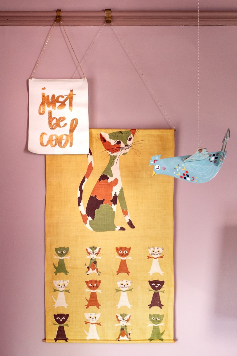
The silhouette art is actually a quilt! It used to hang in our living room ages ago, before Eleanor was even born. It was a made by an Etsy seller, long out of business (Dream of Stars), and I stretched it over canvas stretcher bars. 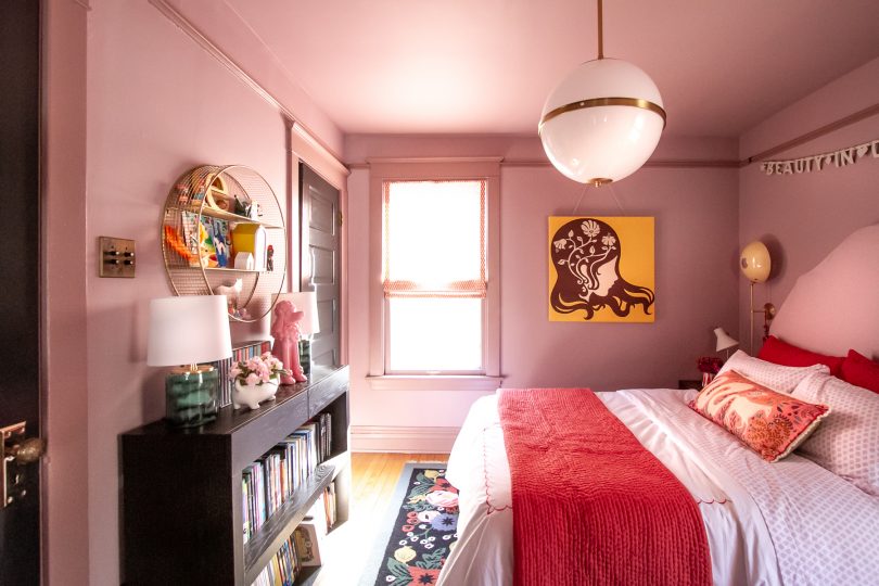
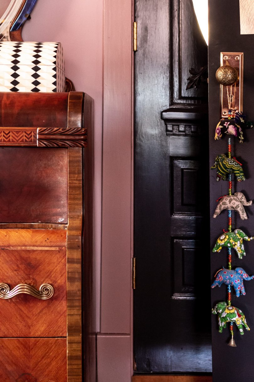
The antique Art Deco dresser was a Facebook Marketplace find. That and the Pondicherry headboard are probably two of my best FB Marketplace finds ever! E is a lucky girl. 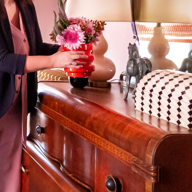
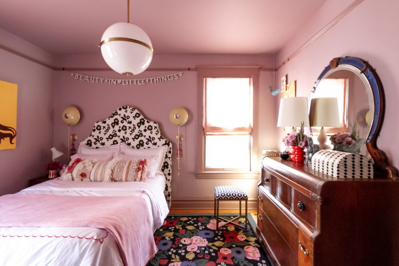
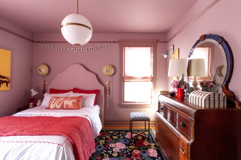
Her room glows beautifully at night. The Crystorama Truax Pendant in the center of the room is oversized (16″ diameter, which is larger than the globes I have in our double parlor), but it provides a dramatic sense of scale. There are three candelabra bulbs inside, so it’s bright without being harsh. 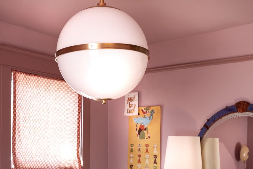
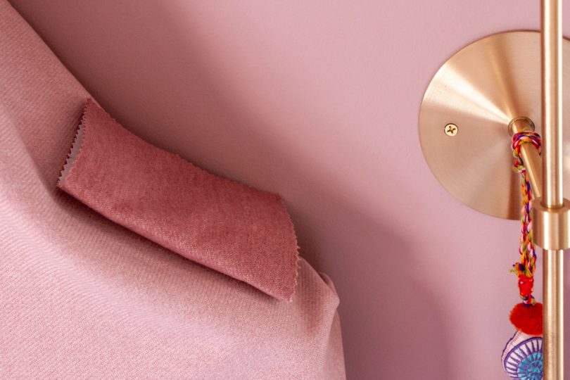
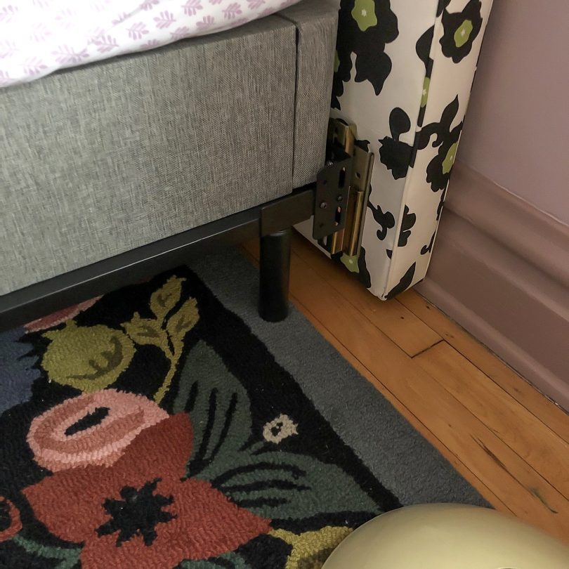
Flanking the headboard are a pair of POP Wall Sconces from Blueprint Lighting. They look like eyeballs and I love them! A happy bit of happenstance is that the headboard I found had curves that perfectly mirror the circles of the sconces. I hung colorful tassels from World Market to zhush them up a bit but if they look too little kid for E as she gets older, she can take them off and they’ll look cleaner and more modern. 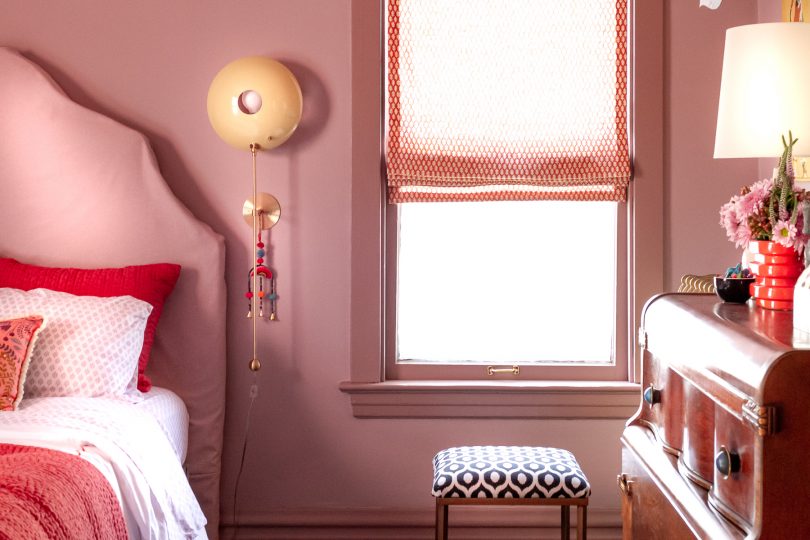
I wasn’t sure about also including a task light on the nightstand. E says she can read by the sconces, but the task light is far brighter and I thought she may like it. It’s the same light she had before (from Target a few years ago). 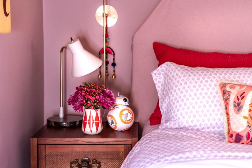
The bookshelf got a pair of new lamps from Target which were very cute and super affordable at $20 each. They came in pink and black versions too, but I thought the green would be nice for a little contrast. The pink gourd lamp that used to be on the dresser before got moved over to the dresser. It was yet another lamp from Target (I think they’re always a great source for cute, inexpensive lighting for the kids’ rooms). 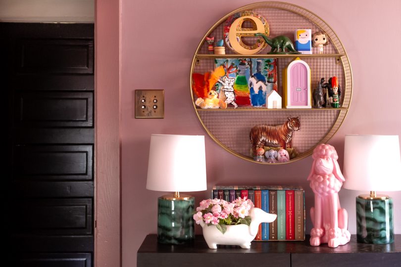
Thank you for following along as this room came together. It has been one of the most fun makeovers I’ve done because it was a true collaboration between me and my daughter. I hope you’ve enjoyed seeing it come together as much as we have! 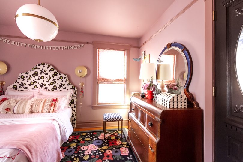
I’ll work to get all of the sources listed on the Shop Our House page and will also add them below!
Follow along with the One Room Challenge participants!
• At Charlotte’s House • Design Addict Mom • Erika Ward Interiors • Erin Kestenbaum • Girl & Grey • Gray Malin • Hommeboys • I Spy DIY • Jewel Marlowe • The Learner Observer • Making it Lovely • Nicole White Designs • Old Brand New • Oscar Bravo Home • Place of My Taste • The Rath Project • Room for Tuesday • SG Style • Undecorated Home • Veronica Solomon • Media BH&G • TM by ORC My One Room Challenge SponsorsThank you to the following sponsors for generously providing product. My One Room Challenge PostsFollow along from the beginning! And check out my previous One Room Challenges! © 2019, published by Making it Lovely as One Room Challenge: Week 6 (My Daughter’s Room Reveal!) | 2 comments | This post may contains affiliate links; I will be compensated if you make a purchase after clicking on my links. The post One Room Challenge: Week 6 (My Daughter’s Room Reveal!) appeared first on Making it Lovely. I was going to DIY an upholstered headboard until I came across someone selling a Serena & Lily Pondicherry headboard on Facebook Marketplace. The luckiest find! The scale is perfect — tall and dramatic — and the curved top is great. I even like the fabric, but worry that it doesn’t go with the rug. 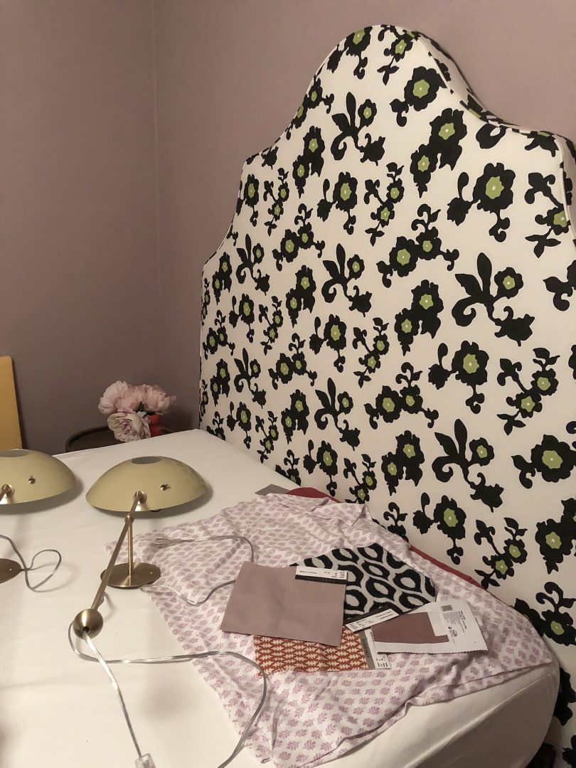
The combination is growing on me, but I do think a slipcover in my original fabric choice (tone on tone with the walls) is the way to go. Eleanor voted for a slipcover too, and then if we ever want to change it up in the future, the original pattern will be right there underneath. None of my fabric is here yet though, and I’m getting worried about having based a lot of my design on it. If it arrives, I’m going to have a lot of sewing to learn and do in a very short amount of time! 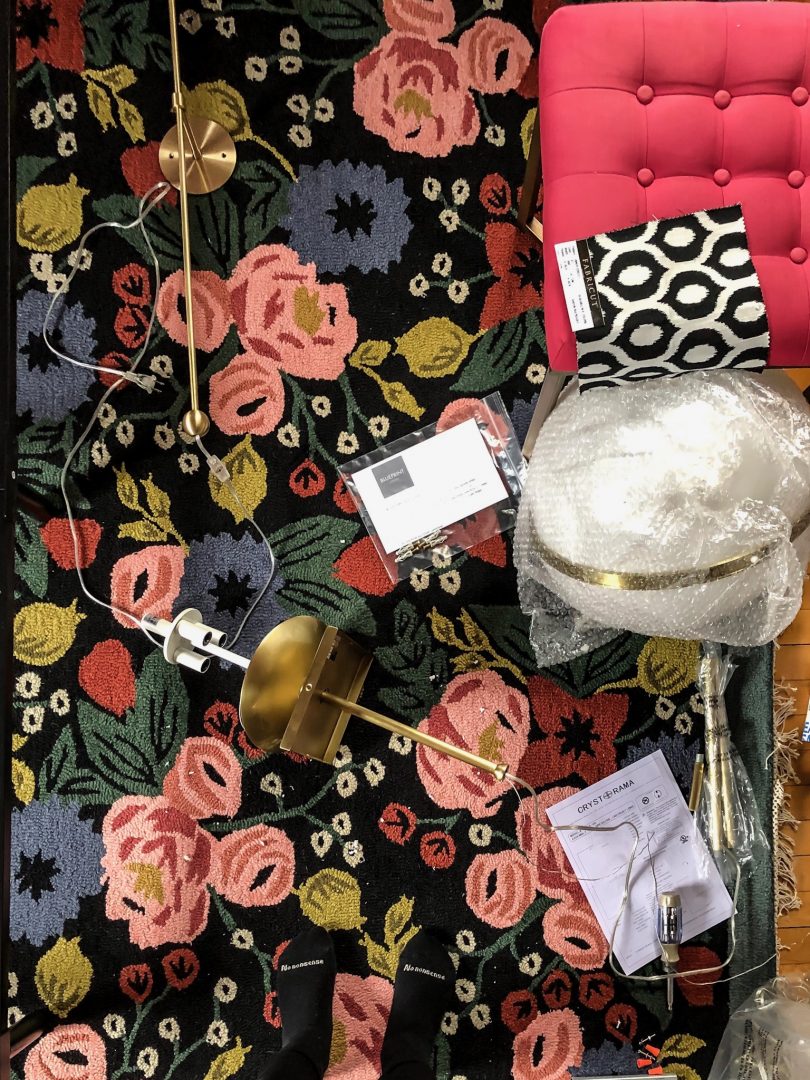
I installed the new light! It’s the 16″ 3-light Truax by Brian Patrick Flynn for Crystorama. I had originally thought I would add a ceiling medallion but the canopy is square. I could switch it out for a round one that would be compatible with a medallion, but having a square element in a room filled with circles and curves is nice! It may stay as-is. 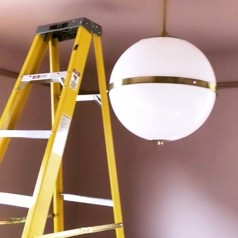
I also have two POP Wall Sconces from Blueprint Lighting to flank the bed. I chose the color (Rubbed Sage) to work with the rug and our initial paint color of light blue. The sconces look great with the rug (tricky, since I only had online photos to go off of when placing the order). I would have chosen differently, probably darker, had I known we were going to paint the walls purple, but that’s in part because I have a specific personal aversion to purple and green together. The combination reminds me of a favorite childhood outfit: purple and green striped sweatpants with a green alligator across the chest of the matching sweatshirt. Chic! Luckily, no one else brings this particular baggage to the color scheme. 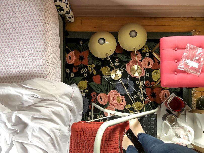
Here they are looking very much like eyeballs. I’m into it. (And that was the old twin mattress, plopped on the full-sized bed frame temporarily. From the side, this arrangement looked like a hungry alligator.) 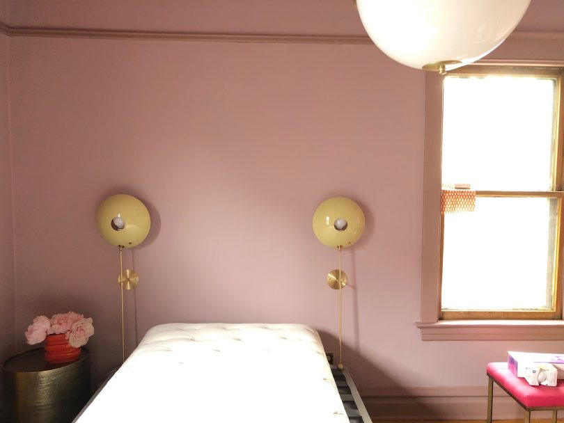
Eleanor has started sleeping in her new bed, even as I continue to work around her and there are tools all over one half of the room. Aside from the headboard, everything else about her bed is from Tuft & Needle. The mattress is on a box foundation, and that rests on a metal base that has brackets to attach to the headboard. She pleaded her case for a larger bed and is thrilled to have it. We have jersey-knit sheets on and she noted how soft they are. Like a favorite t-shirt! Her bed feels great. 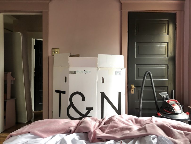
I stood the mattress box between the doorway and closet as a placeholder to show where a bookshelf will go. On the other side, I brought in a new-to-us Art Deco dresser and it’s beautiful. I can’t wait to show you the finished makeover next week! Follow along with the One Room Challenge participants!
• At Charlotte’s House • Design Addict Mom • Erika Ward Interiors • Erin Kestenbaum • Girl & Grey • Gray Malin • Hommeboys • I Spy DIY • Jewel Marlowe • The Learner Observer • Making it Lovely • Nicole White Designs • Old Brand New • Oscar Bravo Home • Place of My Taste • The Rath Project • Room for Tuesday • SG Style • Undecorated Home • Veronica Solomon • Media BH&G • TM by ORC My One Room Challenge SponsorsThank you to the following sponsors for generously providing product. My One Room Challenge PostsFollow along from the beginning! And check out my previous One Room Challenges! © 2019, published by Making it Lovely as One Room Challenge: Week 5 (A Lucky Find) | No comments | This post may contains affiliate links; I will be compensated if you make a purchase after clicking on my links. The post One Room Challenge: Week 5 (A Lucky Find) appeared first on Making it Lovely. The good news is that everything should come together now pretty quickly, but ack! We’re at week four already! Planning the room started before the One Room Challenge officially began, but then of course my girl switched up the design in week 2. No problem, we can pivot. Then a cold, some tech problems that needed immediate attention, and cracks in the plaster walls that were worse and more numerous than initially suspected threw me off, and this past week kind of happened without much progress. But, I should have everything fully painted and a new light fixture up by tomorrow, then I can unroll the rug, drag the dresser and bed into place, and the room will feel like it’s gone from 5% finished to 65%. 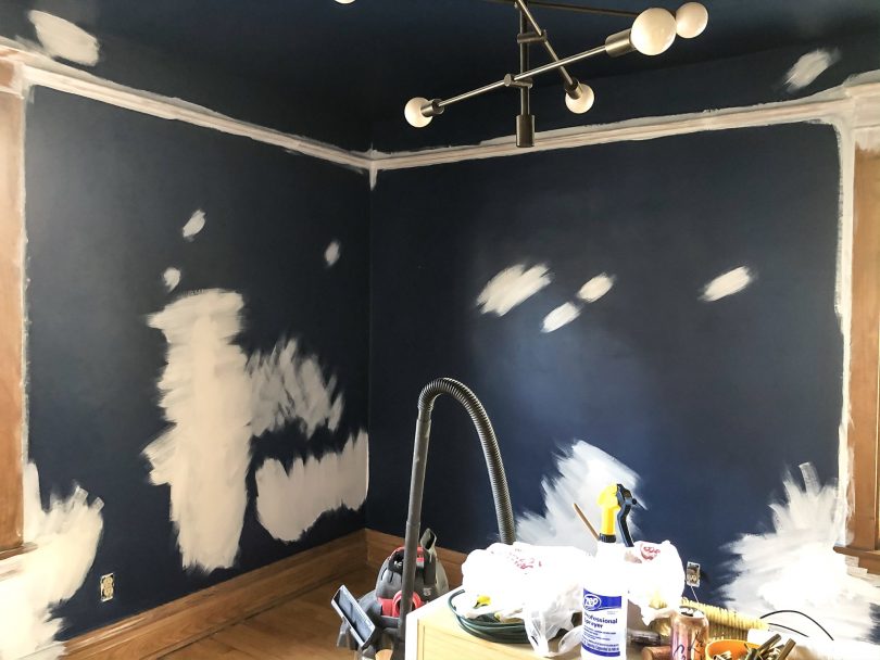
Eleanor and I had our first disagreement on the room’s design. Everything I’m doing, I run it by her first. We chose colors, bedding, and the rug together. I showed her antique dressers as I searched Facebook Marketplace and have made sure she liked the new lighting that will be going in. It’s been a completely collaborative process, and so much fun to work on together. But we disagreed when it came time to choose a color for the trim. 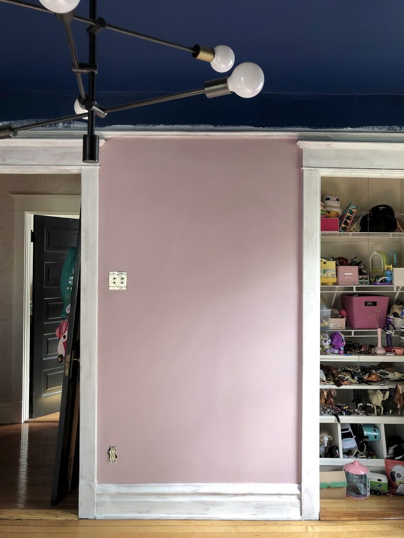
I sanded, cleaned, and primed all of the woodwork, then cut in and painted one wall in our new color (Benjamin Moore Magic Potion 1250). It’s the perfect color between pink and purple, giving us that lilac/orchid/lavender/thistle we were looking for. We were both happy, but when I asked if she thought the trim should be the same color or one shade darker, and she furrowed her brow and said white. And I’m sorry, but white was not an option for a reason. Her room is all slants and angles, and wonky trim highlights the problems. This has been the only design decision that I’ve overruled her on and she wasn’t pleased when I told her it would probably not be white. 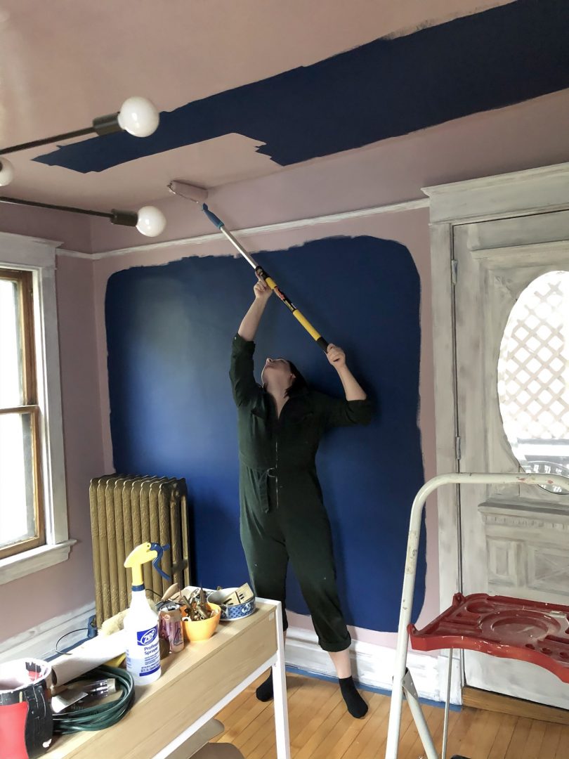
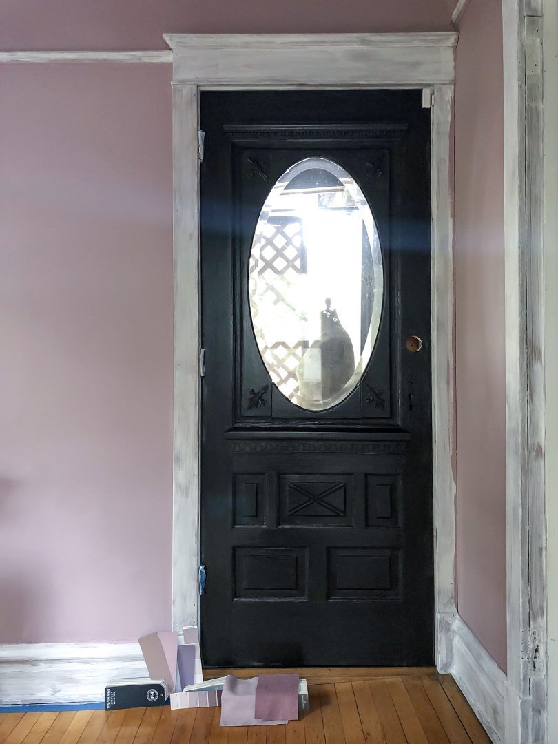
I finished painting the walls and ceiling, and put a coat of black paint on the door before choosing the color. I feel the same was toward white trim as I do white walls. A beautiful choice when done right, but not always great when done as a default, and it really wasn’t the right choice here. I went one shade darker and one swatch over in the fan deck (Benjamin Moore Barberry 1244) and I’m only one coat in but it looks amazing! It also makes it look very Victorian in our Victorian home, but more modern elements are coming. 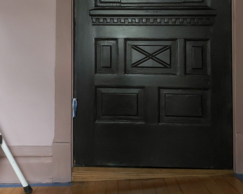
And guess what, Eleanor came home from school, saw the progress, and she likes it. I don’t think she could picture what it would look like beyond the white primer. May that be the last of our disagreements! When it comes to this room makeover, at least. Follow along with the One Room Challenge participants!
• At Charlotte’s House • Design Addict Mom • Erika Ward Interiors • Erin Kestenbaum • Girl & Grey • Gray Malin • Hommeboys • I Spy DIY • Jewel Marlowe • The Learner Observer • Making it Lovely • Nicole White Designs • Old Brand New • Oscar Bravo Home • Place of My Taste • The Rath Project • Room for Tuesday • SG Style • Undecorated Home • Veronica Solomon • Media BH&G • TM by ORC My One Room Challenge SponsorsThank you to the following sponsors for generously providing product. My One Room Challenge PostsFollow along from the beginning! And check out my previous One Room Challenges! © 2019, published by Making it Lovely as One Room Challenge: Week 4 (A Disagreement) | No comments | This post may contains affiliate links; I will be compensated if you make a purchase after clicking on my links. The post One Room Challenge: Week 4 (A Disagreement) appeared first on Making it Lovely. I knew I wanted to do something special in Eleanor’s room. Wallpaper? She wasn’t interested. How about molding? E was neutral and I was fully enamored with the idea, so yes. Absolutely! I love bedrooms with raised paneling, and it would fit well here architecturally. The first floor of any home is usually the most grand, where you might find taller baseboards, finer finishes, and details like paneling or crown molding. Our Victorian has raised paneling in the entryway, beams and crown in the dining room, picture rail in most bedrooms, and beadboard details throughout. Paneling or molding details in the bedroom of an otherwise unadorned house could be incongruous, but here it would fit. 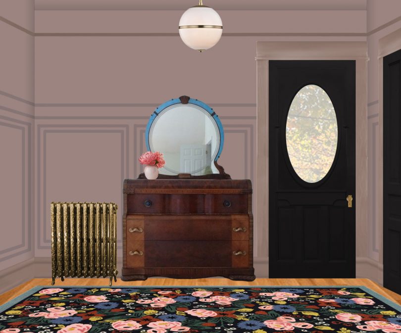
Eleanor’s room has a noticeable slope to it though. That’s that old house charm for you. The floor slants, the ceiling slants, and I doubt you’ll find a true right angle anywhere. I wanted to do this so badly I tried to convince myself that I could cheat it by splitting the difference between level and what appears to the eye to be level, fudging some of the lines to turn rectangles into parallelograms and trapezoids. To a clear-headed person, this sounds like a terrible idea, right? I was dazzled by my brilliant design vision and it took me a while to admit that this probably isn’t the best space for rigid geometry. So no wallpaper. No molding. A canopy bed, or a bed tucked into some sort of fort-like nook with beautiful fabric draping the sides was already ruled out when we instead decided to go from a twin-sized bed to a double. A larger canopy bed would still fit technically, but the scale would have been completely wrong. We’ll be adding color and pattern, of course, but I still wanted to do something beyond paint, add a bed, and hang curtains. Plus it’s the One Room Challenge; I wanted an actual challenge! 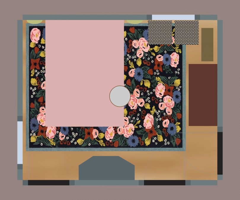
Well, I could make the bed. And do something interesting with the windows. 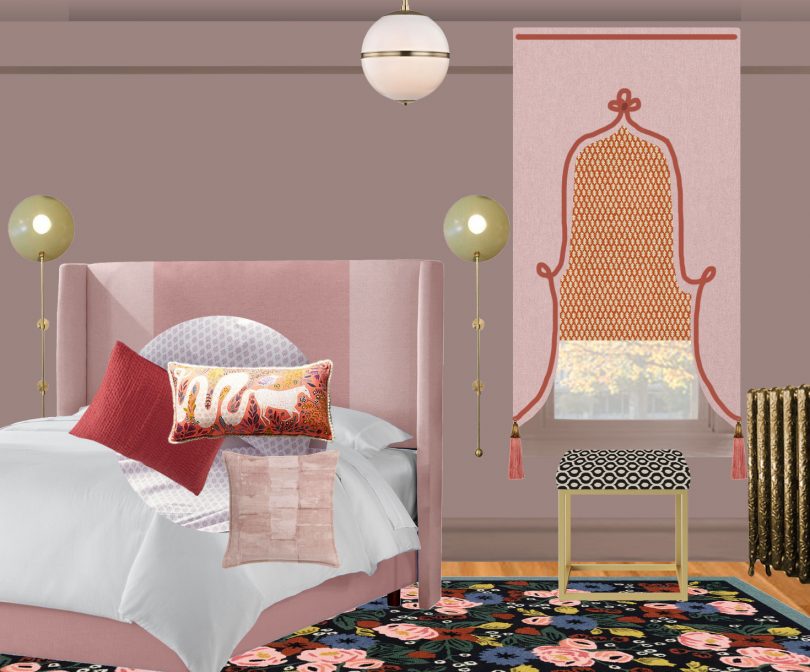
This is a phenomenal idea, yes? Never mind that I am far more comfortable with a saw than a sewing machine. I can do this. Except that my cursory knowledge of how to make a headboard was probably gleaned from formative years watching Trading Spaces. Plywood + foam + batting + fabric = headboard. Easy peasy. Except that I want to made a wingback headboard and it turns out it’s way more complicated than that? So OK, plan B is a simple rectangle with channel tufting. Still difficult, but easier. I’m not sure which option will win, but wish me luck. Wait, we didn’t even get to the windows yet. Get lost, curtains! I’m doing lambrequins. On windows that you can tell just by looking at them have settled with the house and gone out of square. Do I need to change course here as well and go with a valance instead? Eh. Either way, I’ll be doing shades underneath that I plan on making myself. Do I know how? You bet I don’t! Will I figure it out? Oh, for sure! I’m making great decisions with a looming deadline. (If I could renovate old houses and learn how to do all kinds of hard things in the process, surely I can do this. Fingers crossed.) Follow along with the One Room Challenge participants!
My One Room Challenge SponsorsThank you to the following sponsors for generously providing product. My One Room Challenge PostsFollow along from the beginning! And check out my previous One Room Challenges! © 2019, published by Making it Lovely as One Room Challenge: Week 3 (Adding Interest) | No comments | This post may contains affiliate links; I will be compensated if you make a purchase after clicking on my links. The post One Room Challenge: Week 3 (Adding Interest) appeared first on Making it Lovely. |
 RSS Feed
